When it comes to contact forms, I do believe that almost every website should have one (and take them seriously too). I love using them and I especially love designing them.There are few rules when it comes to designing and coding a contact form, but today I want to talk about the design part of contact form. It might seem obvious to more advanced designers, but pretty useful to know for fresh ones.
Contact form usually contains few fields, that have labels, placeholders and typed in text. Also, contact form has a submit button, usually a consent, and an error part. So let’s talk about it one by one.
Input field
Input is usually a place where you enter your text, but it also might be a button, a radio button, a checkbox etc.Since we are speaking about the contact form, it usually contains a text input, an email input, a button, a checkbox and in some cases radio buttons. It might also include a select (drop down), which technically is not an input, but from design perspective let’s call it a sort of input.

Input field is the only necessary field in order to have a functioning form.
UX
There are some things we can make better when we speak of inputs.
Design
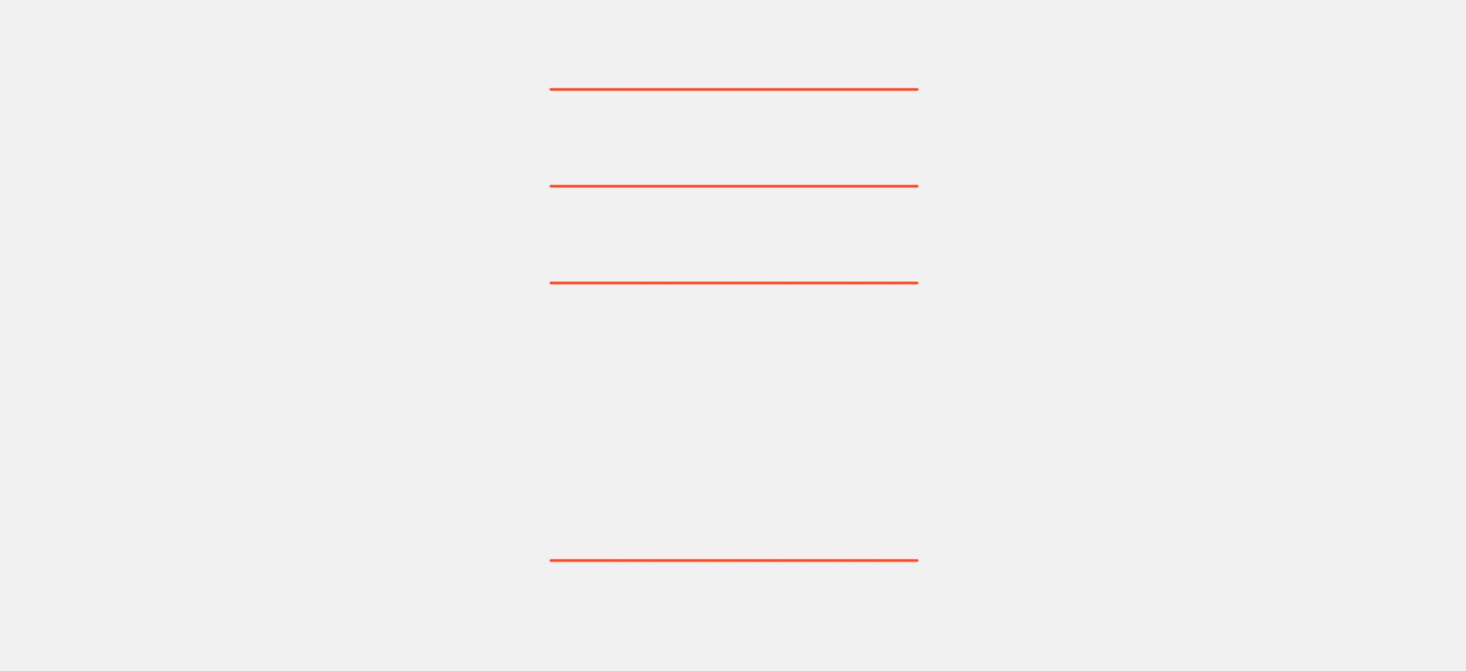
Inputs have their own predefined styles, but we can change it a bit to match our design without sacrificing the functionality. E.g. my favourite is instead of using a box, we can use a line. We can change colors, line weights and the overall look of the input and make it really beautiful and still representative of a brand aesthetics.

Label
Label is the text or an image, that describes the purpose of a certain field.

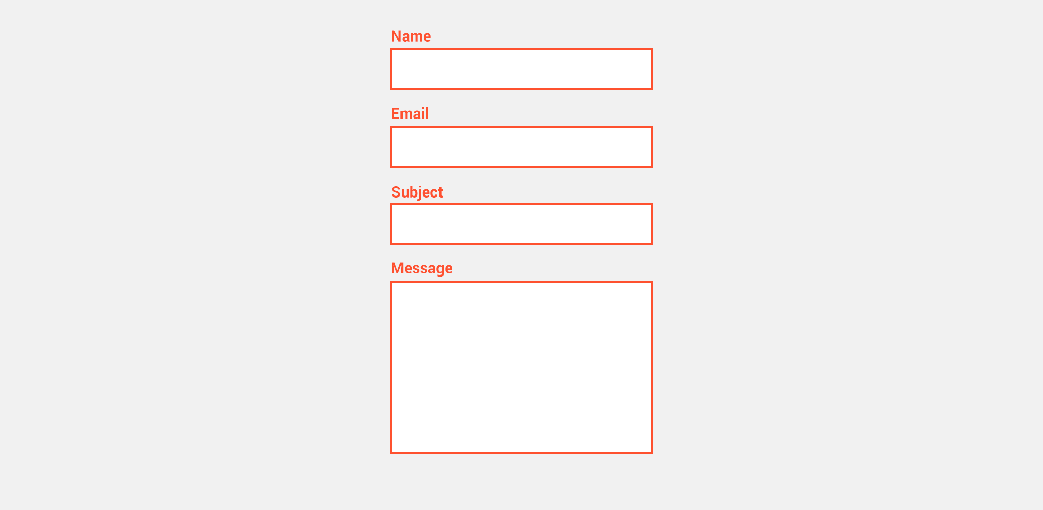
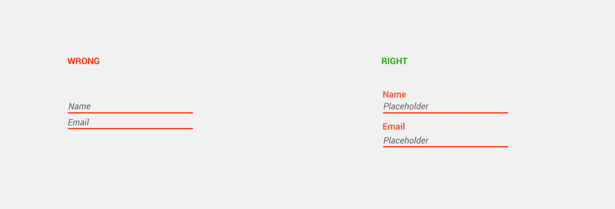
When it comes to labels, they are necessary from a UX point of view. They add some accessibility and also makes really clear for a person what the field is for. Also, people tend to use placeholders instead of a label, but the problem with that is that a placeholder is gone as soon as the person click on it or starts typing, making the field undefined.
UX
Separate from the field – Make it clear that it is a label and not some random text, separate it visually from the input text field.

Label placement – I am guilty of this one too, since I really love inline input fields. But for the better UX you should put your labels on top of the field, since it appears much better in mobile view and will not break the form.

Readability – Make sure you have enough contrast between your background and your label, if the font size is big enough, if the font is easy to read and there is not too much spacing between letters.

Design
There is not much to it, just make the fonts same as the rest of the website and make sure that you have enough space between the label and the field itself.
Make it clear which field is currently selected by marking it with different color or line weight.
Placeholders
Placeholder is a example text to show what a person should enter into certain field. It should be gone as soon as the person click on the field (because if it’s not, a person does not know should they erase it or start typing) and be clear enough to actually help and not confuse.

UX
Placeholder is not a label – You should never use placeholder instead of a label. If you really want to make a placeholder label, you can make a so called “floating label” which is a placeholder that on a click moves above the input field and serves as a label.

Do think user is dumb – You don’t need to ask for name and then enter a placeholder name, unless the label is not clear. Everyone knows what name is. Also should not repeat the same as a label. Nobody want to see email / email.

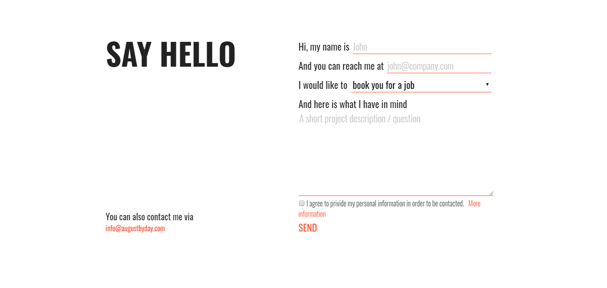
Make a conversation – I am so sick and tired of boring contact forms and forms in general, that I really much prefer seeing something a bit more quirky. Why not make it conversational? E.g. My name is _____, You can contact me vie email ____, I would like to > Ask a question / book you for a job / other.

Design
Separate it from the label and actual text by font style or/and color or/and size. Make it clear that it is a placeholder rather than the actual text.
Typed in text
We need to think not only of what it will look like, but also how will the person interact with it. In this case, the person would most likely want to enter the text, so we need to think of it too.

UX
Formatting – Let’s say we are asking for a phone number, why not make it easier for a person to enter it by adding the country code and dashes to separate the digits? If we are asking for an email, we can add @ so the person would not need to look for it.
Keyboard – When we are designing for mobile, we need to keep in mind the keyboard, so when the user needs to enter the phone number, it opens up with number keyboard rather than making user switch they keyboard types.
Design
Easy to read – easy to read includes font, text size, contrast and letter spacing. Be sure that entered text is not a struggle to read.
Field space – Make sure that the user has enough space to type in, since it would make a person uncomfortable making them scroll the field to make sure they typed their email address correctly.

Uppercase – Try avoid making user type in uppercase, since it might cause confusion and they will think they got Caps Lock on, so you might receive email that is all uppercase and will be hard to read and quote.
Submit button
Submit button is a button that finalizes the form process, in simple works – send the email. It is necessary. Don’t trust in any “Enter” to serve you as a submit button.

UX
Simply put, make it clear – clear words and visible button. Simple as that.
Place – Don’t leave it floating. Make it visible and in reasonable place as if it would be another field in your form.
Design
Make it your brand colors and font, and make it visible, with enough contrast from the background and big enough text size.
Error check
So if the user accidentally forget to enter the field, or entered the text incorrectly we need to be able to quickly communicate what happened.

UX
When our user does not fill the required field, or fills it incorrectly we need to explain what happened. That we can do by three steps :
Error message – We should display an error message, that says what happened – e.g. the email field is empty. Tell them exactly what happened.
Color – We can indicate that the field is incorrect by changing the input box color. Make it visible. Make it red.
Hint – We can help our user further by saying what they did wrong – is it incorrect or is it empty? Maybe the user entered symbols that could not be used in email address?
Design
Designing errors and hits is necessary, since it is a part of a contact form that designers usually forget. Make it clear, simple and easy to read. It has to serve the function first so no need to be super artsy with it.
Consent
If you are European citizen, you might need to use the consent check mark below your contact form. Most designers do not like it, but it must be there. Simple as that, you make it clear why you need information, add link to your privacy policies and add a check mark that needs to be checked in order to send an email.

UX
Clear text – Make it clear what it does, be friendly and humane. Don’t be a robot since people would like to believe there is a human behind every website.
Easy to click – Don’t hide it somewhere, where a person needs to look for it. Make it easy to click, so it would be impossible to miss and there would be no struggle. Nobody wants to look for a required check mark field.
Design
It is not pretty, but it is necessary. Make it simple, clear and it will not ruin your design.
General design rules
Readability
Try to avoid readability problems, that most of the time cause by :
Font – the font should be simple and easy to read.
Small font size – suggested size is 16 pixels, you can go few pixels up or down depending on the font, but keep it civil.
Wrong color – some color combinations makes text really hard to read. If your eyes are sore while designing it, it might be a good time to check if the combination is not too aggressive. Also, you can convert it to black and white or colorblind mode to see if it’s still readable.
Wrong spacing between letters – 0 is the best. Avoid making spaces too large or too small.
Wrong letter formatting – Most of the time there is no space for uppercase. Try to avoid it, since it is harder to read (funny, but truth). Though if it’s short enough or big enough you can make it work. Just try to avoid small uppercase.
Conclusion
A good contact form is a great way to encourage users to engage with the brand, while bad and uneasy feeling form might discourage them from doing so. You can easily change that with few design decisions that will not only increase the engagement, but also will make a bold statement to the website.
